
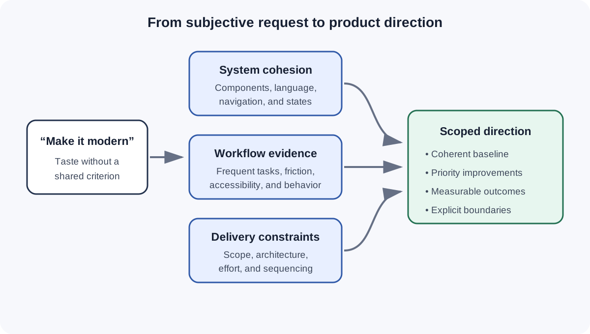
The request sounded simple: make the product feel more modern.
Most teams have heard some version of it. The interface looks dated. A competitor feels cleaner. Someone saw a new pattern somewhere, or an AI-generated concept made the existing experience look old by comparison. The reflex is to start changing the visual language — more space, softer corners, different navigation, fewer borders.
But "modern" falls apart the moment you press on it. Modern compared to what? For which person? What should become easier after the change? How much of the product needs to move, and what's already working well enough to protect?
A subjective request like that can create a surprising amount of objective work.
Modern isn't a product design requirement. It's usually a placeholder for a problem the team hasn't named yet.
Taste Creates Motion, Not Direction
There is nothing wrong with wanting a product to feel current. Visual quality affects trust. An interface assembled across several years can become inconsistent, difficult to learn, and expensive to maintain.
The problem starts when a feeling becomes the acceptance criterion.
One stakeholder may mean less visual density. Another may mean a new navigation model. A designer may see typography and spacing problems. Engineering may hear a request to replace the component library. Customers may not care about any of those things; they may want to finish a frequent task without reaching for the mouse.
The team can produce several credible directions and still have no shared way to choose among them.
This is where redesigns begin to swing. The first concept changes too much. The second protects too much. Feedback becomes a series of preferences: cleaner, bolder, simpler, more premium, not quite there. Each round moves the artifact without making the decision clearer.
AI can intensify this problem. It is now cheap to generate a polished alternative before the team has defined what the alternative needs to improve. More concepts can make the discussion feel productive while leaving the underlying ambiguity untouched.
As I wrote in When AI Makes the First Draft, Your Portfolio Needs to Show Your Judgment, a convincing output is not evidence that the right decision was made. The same applies inside a product team.
Start With Cohesion as the Baseline
When a product has accumulated inconsistent patterns, cohesion is a more useful first goal than modernity.
Cohesion gives the team something observable to work with:
- common components behave the same way;
- typography and spacing follow a shared system;
- navigation uses consistent language and placement;
- states, controls, and feedback patterns feel related;
- new work reuses established decisions instead of creating another local solution.
This does not mean applying fresh colors and calling the product redesigned. It means reducing the number of rules a person has to learn and the number of exceptions the team has to maintain.
Consistency is one of the long-standing usability heuristics documented by Nielsen Norman Group. The practical value is easy to see: people should not have to wonder whether different words, controls, or situations mean the same thing.
A cohesive baseline also gives the team a better scope boundary. Some work belongs in system alignment: tokens, components, navigation, content patterns, and states. Other work belongs in workflow improvement: fewer steps, better defaults, keyboard support, clearer prioritization, or a different information structure.
Those are related, but they are not interchangeable. Separating them prevents a visual refresh from quietly becoming a full product rewrite.
Find the Friction Under the Aesthetic Request
Once the baseline is clear, the more valuable question is what people struggle to do today.
Imagine a support specialist moving between several active conversations. The product may look visually dated, but the most expensive friction could be interaction switching: the person types a response, moves a hand to the mouse, opens a menu, selects a saved action, returns to the keyboard, and repeats that sequence throughout the day.
Rounded cards will not fix that.
Keyboard navigation, text expansion, clearer focus states, and better prioritization might. The visual system still matters, but now it supports a concrete workflow rather than standing in for one.
This is also an accessibility issue. The Web Content Accessibility Guidelines explain that functionality should be operable through a keyboard interface. A team that studies real interaction patterns may find an improvement that helps people with disabilities while also reducing effort for high-frequency users.
That is a much stronger product direction than “make it feel newer.” It identifies the behavior, the cost, and the condition the design needs to improve.
A useful discovery prompt is:
> When someone says the product feels dated, what observable friction are they using that word to describe?
Sometimes the answer is visual inconsistency. Sometimes it is slow navigation, poor hierarchy, unfamiliar language, or a workflow built around the organization instead of the person using it. The word modern may be the only language someone has for the accumulated frustration.
Do not dismiss the request because it is subjective. Translate it.
Give the Redesign More Than One Level
Redesign conversations often fail because every possible change arrives in one package. A token update, navigation adjustment, interaction improvement, and platform rethink all compete for the same approval.
I have found it more useful to describe levels of change:
- Align the system. Bring the existing product into a coherent visual and interaction language. Fix drift before inventing another direction.
- Improve priority workflows. Use evidence to address recurring friction, accessibility gaps, weak hierarchy, and unnecessary steps.
- Reconsider the model. Change the information architecture, core interaction model, or platform structure only when the problem requires it.
These levels are not a rigid roadmap. They are a way to make the decision legible.
A team may choose pieces from the first two levels together. It may discover that a workflow problem cannot be solved without deeper structural work. The point is to stop treating every redesign as a binary choice between a cosmetic refresh and rebuilding everything.
The levels also help product and engineering participate earlier. Engineering can identify where system alignment reduces maintenance cost and where a seemingly small interaction crosses a technical boundary. Product can connect workflow changes to customer behavior, adoption, or operational outcomes. Design can protect coherence while showing why one improvement deserves more investment than another.
That is the kind of shared decision-making I mean when I talk about moving from design artifacts to product outcomes. The concept is not the strategy. The team’s ability to explain what changes, why it matters, and how far to go is the strategy.
Make the Review About Evidence
The review questions need to change with the brief.
Instead of asking, “Does this feel modern?” ask:
- Which inconsistencies does this direction remove?
- Which frequent task becomes easier or faster?
- What behavior or evidence led us to this change?
- What existing pattern are we protecting, and why?
- Is this a system correction, a workflow improvement, or a change to the product model?
- What would tell us that the change worked?
These questions do not eliminate taste. Design still requires judgment. Visual character, hierarchy, proportion, and craft cannot be selected by spreadsheet.
They do keep taste in the right role. Taste can shape the answer after the team understands the problem. It should not be the only way the team evaluates the answer.
This framing also makes feedback more useful. “I prefer the other version” becomes “The other version made the primary action easier to find.” “This feels cleaner” becomes “This direction removes competing controls from a task people complete repeatedly.” The conversation moves from reaction toward consequence.
A Current Product Is a Coherent Product
Trends keep moving, and AI keeps making them easier to imitate. A team can spend a remarkable amount of time chasing proof that other products were designed more recently.
The product doesn't need to prove the team has seen the latest interface trend. It needs to feel intentional.
That means the parts belong together. Frequent work carries less friction. Accessibility is built into the interaction model. The team knows which problems it's solving and which it's leaving alone — and product, design, and engineering can explain the scope in the same language.
A good redesign may look more modern when it's finished. That's the result, not the requirement.
The useful shift is from "make it feel new" to "make the system coherent and the work easier." Once the team can name that, it has a direction it can actually design against.