
A designer received a familiar exercise: create two mobile screens that help a traveler find the right baggage belt after a flight. The early concepts focused on search, results, and the visual hierarchy between flight details and the belt number.
The screens could solve the assignment. They also assumed the traveler needed to open the product at all.
If the system already knows the flight and the belt, a timely notification may do more useful work than a polished lookup flow. The interface should support the answer, not become a tollbooth in front of it.
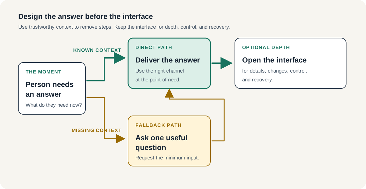
Design the answer before you design the interface. Start with what the person needs to know, when they need to know it, and which channel can deliver it with the least effort. Then design the screen that handles everything the direct answer cannot.
A Screen Can Be the Wrong Unit of Work
Teams often describe product work through its visible container: a page, a dashboard, a chatbot, an app, or a feature. That framing makes the work tangible, but it can also narrow the solution before anyone studies the moment around it.
A traveler walking through an unfamiliar terminal does not want to complete a baggage-lookup flow. They want to know where to go. Opening an app, finding the feature, entering a flight number, and reading a result all add steps between the need and the answer.
Those steps may be necessary when the product lacks context. They should not become the default simply because the assignment asked for screens.
This distinction applies far beyond travel.
A customer waiting for an order wants to know whether it arrived. A manager reviewing a request wants to know what changed and whether they need to act. A patient preparing for an appointment wants to know where to go and what to bring.
Each situation may require an interface. Each one may also support a more direct answer through a notification, email, message, calendar event, printed instruction, or connected device.
Start With the Moment, Not the Artifact
Before you map the flow, write one sentence that describes the person's situation without naming a product surface.
For the baggage example, that sentence might read: After landing, the traveler needs the assigned belt and a clear route to it.
That statement gives the team more room than “design a baggage finder.” It identifies the timing, the information, and the next action without deciding how the person must retrieve them.
Then ask four questions:
- What does the person need right now? Separate the essential answer from useful supporting detail.
- What does the system already know? Account, booking, location, status, and prior choices can remove work when the product can use them responsibly.
- Where can the answer meet the person? Consider the channel they already use at that moment before asking them to enter another one.
- What happens when context is missing or wrong? Build a fallback that asks for the smallest reliable input and offers a clear recovery path.
These questions turn interface design into service design at a useful scale. You do not need to map an entire organization. You only need to understand how the answer reaches the person and where that path can fail.
Use Known Context to Remove Work
Context has value when it saves the person from repeating what the system already knows.
If a signed-in travel product knows the itinerary and receives the belt assignment, it can send the essential answer when the plane arrives. The notification can make the belt number prominent and offer directions as the next action. The full interface remains available for changes, multiple bags, accessibility needs, or an incorrect assignment.
This approach does not eliminate the screen. It changes the screen from a required checkpoint into deeper support.
The same principle sharpens product hierarchy. If the person opens the app, the urgent answer should still dominate. Flight metadata can confirm the context, but it should not compete with the belt number the person came to find.
That follows the broader principle in Good Product Design Answers the Next Question: a useful result helps someone continue. The difference here concerns delivery. Sometimes the product should answer the first question before the person enters the flow.
Build the Fallback as Carefully as the Direct Path
Known context will sometimes fail. A traveler may not have an account, the booking may not connect, the notification may arrive late, or the belt may change.
A proactive experience still needs a strong fallback.
Ask for the most reliable information the person can provide with the least effort. A flight number may give the cleanest result.
If they do not know it, origin and arrival time may offer a second route. If the system cannot confirm the answer, say so and point to a dependable source instead of producing a confident guess.
This structure creates a simple progression:
- deliver the answer when the product has trustworthy context;
- request one useful input when it does not;
- add another input only when the first cannot resolve the need;
- provide recovery when the system cannot complete the task.
The fallback deserves the same attention as the ideal path. It protects the experience from turning convenience into confusion.
Proactive Does Not Mean More Notifications
A team can misuse this principle by pushing every available update into a person's day. That replaces interaction cost with interruption cost.
A proactive message earns its place when the information is timely, specific, and likely to support an immediate action. It should also respect consent, privacy, device visibility, and accessibility settings, and account for the risk of stale information.
The product needs to show what changed when the answer can change. A new belt assignment should replace or clearly correct the previous one. A notification that persists after the underlying information expires can create more work than the lookup it replaced.
This is why “make it modern” offers little direction. As I wrote in Modern Is Not a Product Design Requirement, product quality comes from solving the actual workflow, not applying the surface associated with a current trend. A notification, conversational interface, or AI agent only helps when it fits the moment better than the alternatives.
Design the System Behind the Answer
Direct delivery asks the team to work beyond the screen. The product needs a trustworthy event, a rule for who should receive it, clear content, a destination for more detail, and a fallback when delivery fails.
Designers do not need to engineer that system alone. They do need to make its states visible and help the team decide what the experience promises.
Getting closer to implementation helps. Designers do not need to become engineers, but they should understand enough about data, events, permissions, and failure states to avoid designing a direct answer the product cannot reliably provide.
Map the dependencies beside the interface:
- the event that triggers the answer;
- the source that supplies it;
- the confidence required to show it;
- the channel and timing rules;
- the action that follows;
- the stale, changed, and failed states.
This small system map often exposes the most important design questions before visual refinement begins.
Measure the Effort You Removed
A direct answer should make the task easier, not merely move it to another surface.
When the product launches, look for evidence that people reach the needed information with fewer steps, less repeated input, or fewer recovery attempts. Watch whether they still open the full interface, whether they use the next action, and where they fall back to manual search or support.
Those signals do not automatically prove a broader business outcome. They show whether the delivery choice reduced effort in the moment it was meant to improve.
The verdict is simple: do not make a person navigate your product to retrieve an answer the product can responsibly bring to them. Design the answer first, deliver it at the point of need, and use the interface for depth, control, and recovery.