
The design exercise looked straightforward: help someone find the right baggage carousel after a flight.
The first answer was the familiar one. Give the traveler a way to look up the flight, then show the belt number. Clean screens. Technically complete.
But the lookup screen didn't feel like the center of the experience.
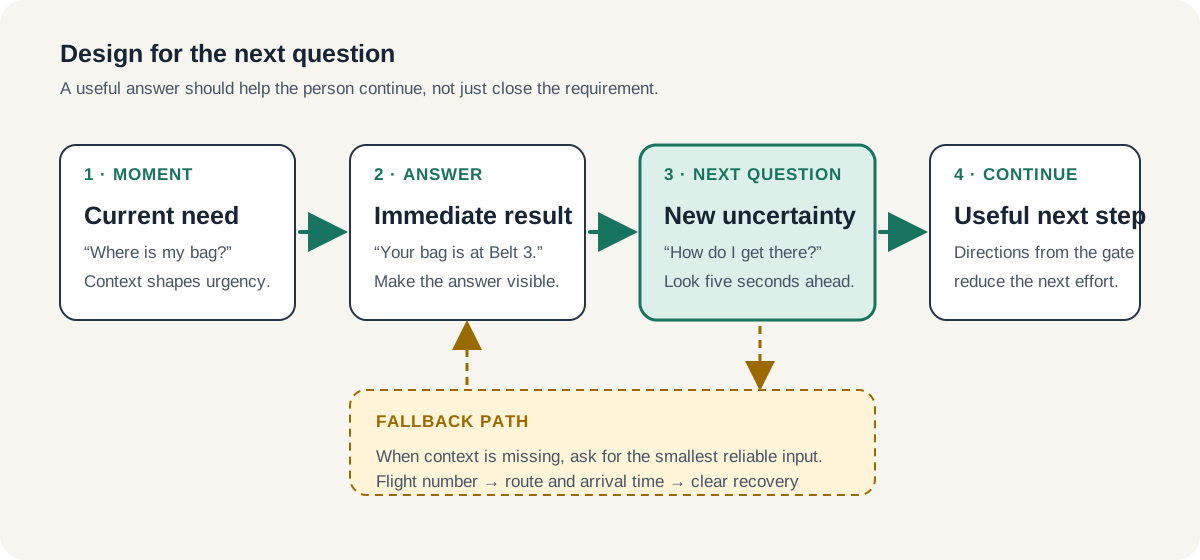
If the airline already knows the passenger's flight, why make them search at all? Send the belt number when the plane lands. And once they have it, the next question arrives almost immediately: How do I get there from this gate?
A product can answer the question it was given and still leave the person carrying the work.
Good product design does more than resolve the current task. It anticipates the next reasonable question and helps the person continue.
A Correct Screen Can Still Be an Incomplete Experience
Teams naturally organize work around screens, requirements, and acceptance criteria. Those are concrete. They give us something to estimate, design, build, and review.
People do not experience products in those units.
They experience a chain of changing questions:
- Where is my bag?
- How do I get to that belt?
- Has the bag arrived yet?
- What do I do if it does not appear?
- Where do I go after I collect it?
A screen that says “Belt 3” may answer the first question perfectly. If the traveler has landed in an unfamiliar terminal, is managing children, or cannot hear the airport announcement, it may not reduce much anxiety on its own.
The experience becomes useful when the answer creates forward motion.
That does not mean every product needs to solve the entire journey. It means the team should understand where its responsibility ends and whether that ending makes sense to the person using it.
Design the Transition, Not Just the Destination
I keep coming back to transitions because that is where product friction tends to hide.
The destination is usually obvious. Show the account balance. Confirm the appointment. Display the baggage belt. Tell the customer the order shipped.
The transition requires more judgment. What can the person do now that they know? What changed in their situation? What uncertainty did the answer create?
An appointment confirmation might make the next step directions, preparation instructions, or a clear way to reschedule. A shipping notice might lead to a delivery window or a safe-place preference. A balance might need context about a pending payment before it becomes meaningful.
This is close to the distinction I wrote about in From Design Artifacts to Product Outcomes. The artifact can satisfy the requirement. The outcome depends on what the person can do because of it.
A useful review question is:
> What will the person reasonably ask five seconds after this screen does its job?
That question is specific enough to change a design. It moves the conversation beyond “Is the information here?” toward “Can the person continue?”
Pull Is Often a Fallback, Not the Main Experience
The baggage example also exposed another common pattern. Teams often start with the interface the person can open because that is the thing they have been asked to design.
But opening the product, finding the feature, entering a flight number, and reading the result may all be avoidable work.
When the system already has reliable context and the information is time-sensitive, proactive delivery may be the better experience. A push notification, text message, email, or well-timed in-product update can put the answer where the person needs it without requiring a search.
The principle is not “send more notifications.” Most people already receive too many. Proactive delivery earns its place when the information is:
- expected and immediately useful;
- based on context the system can trust;
- delivered through a channel the person has allowed;
- clear about what changed and what to do next.
That last point matters. “Your baggage is at Belt 3” is more useful than “Baggage information updated.” Add directions from the arrival gate, and the message starts to support the transition rather than simply announce a state.
The lookup flow still matters. It becomes the fallback for someone who is not signed in, has notifications disabled, or is meeting a traveler rather than taking the flight. The mistake is treating the fallback as the whole product because it happens to require more screens.
Visual Hierarchy Should Reflect the Moment
Once the person reaches the interface, the design still has to recognize what matters now.
In this case, the belt number is not one piece of flight metadata among several. It is the answer. The flight number and route help confirm that the answer belongs to the right trip, but they are supporting information.
That distinction should be visible.
It sounds basic, but teams lose it easily. Product screens accumulate labels, cards, status indicators, brand elements, and actions until the most important information has the same visual weight as everything around it. The interface becomes complete and the decision becomes harder to see.
A simple hierarchy is often enough:
- Put the immediate answer first.
- Use secondary details to build confidence in that answer.
- Surface the most likely next action.
- Keep recovery available when the answer is wrong or incomplete.
This is not only a visual-design choice. It is a product decision about the sequence of attention.
Anticipating the Next Question Is Not Feature Creep
There is a reasonable concern here. If every answer creates another question, does the product keep expanding forever?
It should not.
The goal is not to surround a simple task with a marketplace of loosely related features. A traveler who needs a belt number probably does not need a wall of promotions for restaurants, taxis, hotels, and currency exchange. Those may be adjacent to the trip, but adjacency alone does not make them useful.
I use a narrower test. The next step should be:
- Immediate: likely to matter in the next few minutes, not someday.
- Connected: caused by or directly related to the answer just given.
- High confidence: useful to a meaningful share of people in that moment.
- Low friction: easier to use than to solve independently.
Directions to the baggage belt pass that test. A generic travel offer probably does not.
This is where restraint matters. Anticipation without judgment becomes clutter. Judgment turns context into continuity.
The Fallback Paths Reveal the Product Thinking
The happy path gets most of the attention because it is easier to make coherent. The product recognizes the traveler, knows the flight, and delivers the right information at the right time.
Real use is messier.
Someone may know the flight number but have no account. Someone meeting a passenger may know only the origin city and arrival time. The belt assignment may change. Location services may be unavailable. The notification may arrive before the airport system has settled on a carousel.
These are not reasons to abandon the proactive experience. They are reasons to design a small set of honest fallback paths.
This is also where making design reasoning visible helps product and engineering. Instead of handing over one polished screen, the designer can explain the model:
- Use known context to deliver the answer proactively.
- Let people recover with the smallest reliable input.
- Show when the information was updated.
- Provide a clear path when the answer changes or cannot be found.
Now the team has something more durable than a layout. It has a shared understanding of how the experience should behave.
AI Makes Literal Answers Easier
AI can produce a plausible lookup flow in minutes — the form, the results card, the confirmation state, the polished copy.
That speed is useful. It also makes the designer's judgment easier to see.
The generated flow will usually answer the prompt literally. The more valuable move is noticing that the requested interface might be the fallback, that the primary answer belongs in another channel, or that the real friction starts after the result appears.
I wrote recently that when AI makes the first draft, a portfolio needs to show judgment. The same holds in the work itself. Producing the first answer keeps getting cheaper. Understanding the sequence of questions around it is still product design.
The next time a screen looks complete, don't ask what else to add. Ask what happens five seconds later.
That's usually where the experience reveals whether it understands the person or only the requirement.