
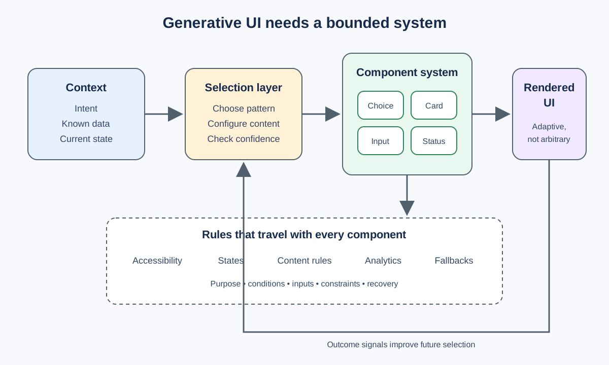
Generative UI promises interfaces assembled around a person's context instead of selected from a fixed set of screens. The early conversations always drift toward possibility: the system chooses the right card, question, control, or next step for the moment. The experience feels less like navigating software, more like continuing a useful conversation.
Then you start defining the components.
What states does a choice need? When does the system use a slider instead of a short list? What happens when a response fails? Which parts can change with a brand, and which must stay consistent? How does someone recover when the interface presents the wrong next step?
The more dynamic the interface becomes, the more important its boundaries become.
Generative UI doesn't make a design system optional. It turns the system from a library people browse into a set of rules the product can act on.
Generation Is Not the Same as Invention
“Generative” can suggest that the interface creates whatever it needs in the moment. That sounds flexible. It is also a difficult foundation for a product people need to understand and trust.
A useful generative interface does not need to invent a new control every time someone asks a question. It needs to select and configure an appropriate pattern from a system the team understands.
That distinction changes the work.
Instead of asking an AI to draw an interface, the team defines a bounded vocabulary: cards, choices, confirmations, ratings, progress indicators, explanations, and fallback paths. Each component carries known behavior, content constraints, accessibility requirements, and visual states. The generative layer decides when and how to use that vocabulary.
The system can still create variation. It can change the sequence, content, emphasis, or combination of components. But the interaction remains grounded in patterns that have been designed, built, and tested.
The interface becomes adaptive without becoming arbitrary.
The Design System Becomes a Decision System
Traditional design systems often organize what a designer or engineer can use. They provide components, variants, tokens, documentation, and examples. A person reads the guidance and makes a decision.
Generative UI introduces another consumer: the product itself.
Now the system needs enough meaning for software to distinguish between components that may look equally plausible in a catalog. A set of buttons is not the same as a single-select question. A card that explains an outcome is not the same as one that asks for a commitment. A disabled state may mean “not available,” “waiting,” or “already completed,” and those differences affect what the person understands.
This pushes design-system work beyond visual consistency. The team has to define:
- Purpose: What job does this component perform?
- Conditions: When is it appropriate, and when should it not appear?
- Inputs: What content and data does it require?
- States: What happens while it loads, succeeds, fails, expires, or receives an unexpected response?
- Constraints: How much content can it carry before another pattern becomes more useful?
- Fallbacks: What can the person do when the generated choice does not fit their situation?
- Measurement: What signal tells the team whether the component helped?
Those definitions turn a component library into a decision system. They give the generative layer something more useful than a collection of shapes.
Constrain the Variables That Carry Risk
A generative interface needs room to adapt. Unlimited configuration is not the same as useful adaptability.
The principle underneath: expose variation where it helps the experience, and constrain it where inconsistency creates risk.
Content may change significantly based on context. A card may need a short or long version. A sequence may skip a step when the system already has reliable information. Themes may adjust color, radius, logo, or typography within accessible limits.
Other properties should remain durable. A destructive action should not move unpredictably. A required choice should not look optional. Focus behavior, semantic markup, error recovery, and readable contrast should not depend on what the model happens to generate.
This is not about making every experience look the same. It is about deciding which differences are meaningful.
The same principle applies to component choice. A model may be capable of presenting ten controls for the same data. The team should narrow that range when one pattern is easier to understand, more accessible, or more reliable with the available input.
Good constraints do not reduce intelligence. They keep the product from spending its intelligence on avoidable novelty.
Design the Escape Hatch With the Main Path
A fixed interface can be wrong in predictable ways. A generative interface can be wrong in context.
It may misunderstand what someone is trying to do. It may present a useful option at the wrong time. It may have incomplete data. It may produce a next step that works for the common case and misses the person in front of it.
That makes recovery part of the core component model.
If the interface presents three choices, can the person say that none of them fit? If it recommends a next step, can they inspect why or choose another path? If the generated component fails, does the open text path remain available? If the system lacks confidence, can it ask a clarifying question instead of presenting a polished guess?
The fallback should not feel like leaving the experience. It should be one of the experience’s designed states.
This connects to something I wrote in Good Product Design Answers the Next Question. A component can complete the immediate interaction and still leave the person carrying the uncertainty. In generative UI, the next question may be, “What if none of these are right?” The product needs an answer for that too.
Test the Rules, Not Only the Screens
A team can review a fixed screen and know what everyone will see. Generative UI creates a range of possible experiences, so reviewing a few attractive outputs is not enough.
The team needs to test the rules that produce them.
Start with scenarios that create pressure on the system:
- sparse or conflicting context;
- content that exceeds the intended component limit;
- repeated use in the same session;
- a person changing their answer;
- slow, missing, or failed data;
- keyboard, screen-reader, zoom, and reduced-motion use;
- a recommendation the person rejects;
- a request the component vocabulary cannot express.
Then inspect more than whether the interface rendered correctly. Did the system choose an appropriate pattern? Did the person understand why it appeared? Could they continue when it was wrong? Did the event data preserve enough context for the team to learn from the result?
The artifact under review is no longer one screen. It is the combination of component, selection rule, context, and recovery path.
That requires close design and engineering collaboration. As I wrote in From Figma to Function, the reasoning behind a design often disappears during handoff. A generative interface cannot afford that loss. The reasoning needs to become part of the implementation.
Start Smaller Than the Technology Allows
The technology will usually let the team generate more variation than it can responsibly evaluate.
I would start with a small component vocabulary and a few well-understood decisions. Define the states. Name the inputs. Set content limits. Build the accessible behavior once. Give every generated path a clear fallback. Instrument what the team needs to learn.
Then expand the system when real use reveals a missing capability.
This approach may feel slower than asking a model to produce whole interfaces. I think it creates a faster path to something dependable. The team spends less time debugging inconsistent behavior, reconciling one-off patterns, and guessing why the system chose an interaction.
AI can still help create the code, documentation, test cases, and component variations. That is useful leverage. But the important work is deciding what the system is allowed to do and what evidence would justify doing more.
Generative UI isn't the end of systems thinking. It's where systems thinking becomes visible inside the product itself.
The interface may assemble itself in the moment. The trust behind it still has to be designed.