
The work was all there. Years across products, industries, team structures. He could talk design systems, product strategy, research, delivery — he'd even built an AI assistant that answered questions about his background.
The portfolio was thoughtful. It was also asking every visitor to do too much before understanding who he was.
Open a project. Read the setup. Click again. Interpret the range. Decide which capability mattered most. The AI assistant was interesting, but it added another choice before the basic story was clear.
A portfolio can hold plenty of evidence and still make the candidate hard to place.
Your portfolio's first job isn't to prove everything you can do. It's to make you legible enough that someone wants to keep looking.
The First Review Is a Classification Problem
Designers tend to build portfolios for the deepest review. We prepare the full case study, document the process, explain the tradeoffs, and gather the artifacts that support the result.
That depth matters. It is rarely what the first visitor needs.
The first review is usually a quick attempt to answer a smaller set of questions:
- Who is this person as a designer?
- What kinds of problems have they handled?
- Is there credible evidence that they can do the work we need?
- What should I open next?
A recruiter may be looking for alignment with a role description. A hiring manager may be scanning for a specific gap on the team. A design leader may be trying to understand your level and the scope you can hold.
None of them can see the complete version of you in a short visit. They are looking for a useful reason to continue.
This is where broad experience can become harder to communicate. “I can do research, strategy, visual design, systems, prototyping, and facilitation” may all be true. But when every capability receives equal weight, the visitor has to decide what the story means.
A portfolio should help them make that decision.
Lead With a Useful Point of View
I do not think every designer needs to become a narrow specialist. Product work needs people who can move across boundaries, especially in smaller teams.
But being versatile and presenting yourself as undefined are not the same thing.
A useful point of view gives the range a center. It might be:
- I simplify complex operational products.
- I build and scale design systems across product teams.
- I turn ambiguous early-stage ideas into testable product direction.
- I help established products improve onboarding and adoption.
- I connect service design with the digital tools employees use to deliver it.
These statements do not describe everything a person can do. They tell the visitor where to begin.
The supporting work can then expand the picture. A design-systems leader may also be strong in research. A product strategist may also produce excellent interaction design. The point is not to hide those capabilities. It is to organize them around a contribution another person can recognize.
The distinction that matters: your positioning should create a door, not a box.
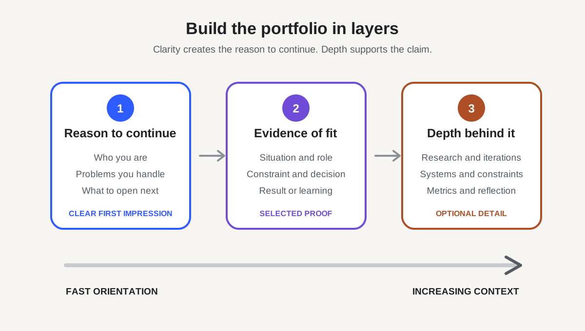
Design the Portfolio in Layers
The portfolio does not need to deliver the whole case in the first screen. It needs to reveal the right detail at the right moment.
I would think about it in three layers.
1. The reason to continue
The home page should make the candidate understandable without requiring a project click.
That usually means a direct description of the work, a small set of relevant capabilities, and selected projects with enough context to distinguish them. “Mobile app redesign” says very little. “Reduced the effort required for field teams to complete daily reporting” gives the project a problem and a setting.
The visitor should be able to see the connection between the person you say you are and the work you chose to feature.
2. The evidence of fit
The project preview and opening of the case study should help someone decide whether this example answers their question.
Name the situation, your role, the team, the important constraint, and the result or learning. Do not make the reader move through a long process recap before they understand why the work mattered.
This is close to what I wrote about in When AI Makes the First Draft, Your Portfolio Needs to Show Your Judgment. The artifact may get attention, but the decision, evidence, and tradeoff make your contribution credible.
3. The depth behind the claim
Once someone understands the project, give them room to inspect it.
This is where research evidence, iterations, design-system details, technical constraints, metrics, and reflections become useful. The material is no longer an obstacle to the story. It supports a question the reader already has.
The same structure helps in a live review. In Your Design Portfolio Should Be Built for Questions, Not Slides, I described a narrative spine with useful branches. A website can work the same way: clear path first, optional depth around it.
The layers let a recruiter scan, a hiring manager evaluate, and a peer inspect the craft without forcing all three through the same amount of detail.
Do Not Make the Interface the Test
Designers understandably want the portfolio itself to demonstrate design skill. That can lead to unusual navigation, animated transitions, hidden project details, or a custom interaction that asks the visitor to learn the site before seeing the work.
Sometimes that creates a memorable experience. Sometimes it turns the portfolio into an obstacle course.
The question is not whether the interaction is creative. It is whether the interaction helps the visitor understand the candidate.
The same is true for an AI assistant.
An assistant can be a useful secondary path. It might help someone explore a long career, ask about a specific capability, or find relevant projects. But it should not carry the primary story. A visitor should not need to invent the right question before the portfolio has explained why the answer matters.
AI can improve retrieval. It does not replace information hierarchy.
If the assistant disappeared, the portfolio should still make the candidate clear. If the motion failed to load, the project should still be understandable. If someone only read the headings and captions, they should still know what kind of designer they were considering.
The design should make the signal easier to see.
Make Every Click Earn Its Place
A click is not inherently bad. Neither is a long case study. The issue is whether each step provides enough value to justify the next one.
A useful audit is to move through the portfolio and ask:
- What does the visitor know before this click?
- What new question does this page answer?
- Is the most important evidence visible, or only available after more navigation?
- Does this detail strengthen the positioning, or merely prove that work happened?
- If someone leaves here, what impression will they carry?
This tends to expose a common problem: the strongest evidence is buried because the case study follows the chronology of the project instead of the curiosity of the reader.
The real work may have taken six months. The portfolio does not have to reveal it in order.
Lead with the problem that shows your fit. Surface the decision that shows your judgment. Use the process to explain how the team reached it. Make the result honest, including what remained unresolved.
That sequence respects both the work and the reader’s limited attention.
Clarity Creates the Chance for Depth
There's a real tension here. Nobody wants to be reduced to a keyword or a single project, and a career rarely fits neatly into one headline.
But the alternative to clear positioning usually isn't a more nuanced first impression. It's no impression at all.
Nuance can be earned in layers.
Start with a recognizable contribution. Support it with selected evidence. Then let the depth of the work complicate and strengthen the picture — where your range mattered, where your judgment changed the direction, where the team needed something beyond your stated specialty.
The goal isn't to make yourself smaller for a hiring system. It's to make the value of your experience easier for another person to find.
A strong portfolio can eventually show how much you can do. First, it has to give someone a reason to keep looking.